

AlexCar
-
Публікації
14 -
З нами
-
Відвідування
Тип публікації
Профілі
Форум
Маркетплейс
Статті
FAQ
Наші новини
Магазин
Блоги
module__dplus_manager
Усі публікації користувача AlexCar
-
 Решение вот такое! Заработало! var objCoords = [<?php echo $geolocation; ?>];
 -
Приветы еще покопался по теме... На сайт из БД выводятся геокоординаты объекта при помощи такого кода: <div id="objCoords"><?php echo $geolocation; ?></div> например: получаем на странице 51.39604170, 83.56039580 Задача: нужно использовать это значение переменной без повторного обращения к PHP и задать его как одну из точек построения маршрута. Имеется: 1 var objCoords = document.getElementById([$geolocation]); 2 3 $('.btn-success') 4 .on('click', function () { 5 controller.route([myCoords, objCoords]); 6 }); Вот тут не пойму как нужно правильно: document.getElementById([$geolocation]) прочитал много всего. Не бейте больно...
-
там реально так сложно?
-
Сделано ничего не поменялось....
-
А можно только с тегами code ? Извините не уловил сразу.. afwollis А кто поможет решить описанные задачки, может дадите рекомендацию?
-
нароООООдд! Кто здесь может помочь за небольшую денежку создать правильный скрипт... 1. При нажатии на клавишу "Схема проезда" - вызов диалогового окна, в котором содержится yandex-карта (это сделано!) 2. Нужно сделать: при вызове окна - автоматическое построение маршрута по двум точкам. а) данные о геолокации пользователя б)значение переменной php 3. Нужно сделать: навести порядок в подключенных javascript-файлах, чтобы работало как положено а) colorbox вывод фотографий, б) остался работать вывод карты с) нормально работали вкладки описания товара (сейчас это сбито) Пишите предложения...
-
Вобщем долго ковырял .... фигня какая-то... взял готовый плагин http://web.warwolf.org/reveal/ встало хорошо но и с ним есть баги... Все вкладки внизу страницы вытянулись в одно "полотно"... ах этот javascript ...
-
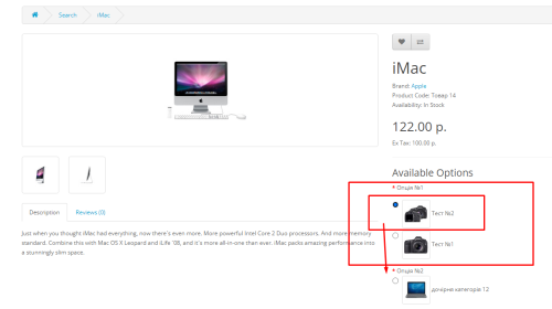
И вот еще... последнее перед выводом футера <?php if ($options) { ?> <script type="text/javascript" src="catalog/view/javascript/jquery/ajaxupload.js"></script> <?php foreach ($options as $option) { ?> <?php if ($option['type'] == 'file') { ?> <script type="text/javascript"><!-- new AjaxUpload('#button-option-<?php echo $option['product_option_id']; ?>', { action: 'index.php?route=product/product/upload', name: 'file', autoSubmit: true, responseType: 'json', onSubmit: function(file, extension) { $('#button-option-<?php echo $option['product_option_id']; ?>').after('<img src="catalog/view/theme/default/image/loading.gif" class="loading" style="padding-left: 5px;" />'); $('#button-option-<?php echo $option['product_option_id']; ?>').attr('disabled', true); }, onComplete: function(file, json) { $('#button-option-<?php echo $option['product_option_id']; ?>').attr('disabled', false); $('.error').remove(); if (json['success']) { alert(json['success']); $('input[name=\'option[<?php echo $option['product_option_id']; ?>]\']').attr('value', json['file']); } if (json['error']) { $('#option-<?php echo $option['product_option_id']; ?>').after('<span class="error">' + json['error'] + '</span>'); } $('.loading').remove(); } }); //--></script> <?php } ?> <?php } ?> <?php } ?> <script type="text/javascript"><!-- $('#review .pagination a').live('click', function() { $('#review').fadeOut('slow'); $('#review').load(this.href); $('#review').fadeIn('slow'); return false; }); $('#review').load('index.php?route=product/product/review&product_id=<?php echo $product_id; ?>'); $('#button-review').bind('click', function() { $.ajax({ url: 'index.php?route=product/product/write&product_id=<?php echo $product_id; ?>', type: 'post', dataType: 'json', data: 'name=' + encodeURIComponent($('input[name=\'name\']').val()) + '&text=' + encodeURIComponent($('textarea[name=\'text\']').val()) + '&rating=' + encodeURIComponent($('input[name=\'rating\']:checked').val() ? $('input[name=\'rating\']:checked').val() : '') + '&captcha=' + encodeURIComponent($('input[name=\'captcha\']').val()), beforeSend: function() { $('.success, .warning').remove(); $('#button-review').attr('disabled', true); $('#review-title').after('<div class="attention"><img src="catalog/view/theme/default/image/loading.gif" alt="" /> <?php echo $text_wait; ?></div>'); }, complete: function() { $('#button-review').attr('disabled', false); $('.attention').remove(); }, success: function(data) { if (data['error']) { $('#review-title').after('<div class="warning">' + data['error'] + '</div>'); } if (data['success']) { $('#review-title').after('<div class="success">' + data['success'] + '</div>'); $('input[name=\'name\']').val(''); $('textarea[name=\'text\']').val(''); $('input[name=\'rating\']:checked').attr('checked', ''); $('input[name=\'captcha\']').val(''); } } }); }); //--></script> <script type="text/javascript"><!-- $('#tabs a').tabs(); //--></script> <script type="text/javascript" src="catalog/view/javascript/jquery/ui/jquery-ui-timepicker-addon.js"></script> <script type="text/javascript"><!-- $(document).ready(function() { if ($.browser.msie && $.browser.version == 6) { $('.date, .datetime, .time').bgIframe(); } $('.date').datepicker({dateFormat: 'yy-mm-dd'}); $('.datetime').datetimepicker({ dateFormat: 'yy-mm-dd', timeFormat: 'h:m' }); $('.time').timepicker({timeFormat: 'h:m'}); }); //--></script>
-
А внизу страницы есть ооочень страшное и непонятное <script type="text/javascript"><!-- $('#button-cart').bind('click', function() { $.ajax({ url: 'index.php?route=checkout/cart/add', type: 'post', data: $('.product-info input[type=\'text\'], .product-info input[type=\'hidden\'], .product-info input[type=\'radio\']:checked, .product-info input[type=\'checkbox\']:checked, .product-info select, .product-info textarea'), dataType: 'json', success: function(json) { $('.success, .warning, .attention, information, .error').remove(); if (json['error']) { if (json['error']['option']) { for (i in json['error']['option']) { $('#option-' + i).after('<span class="error">' + json['error']['option'][i] + '</span>'); } } } if (json['success']) { $('#notification').html('<div class="success" style="display: none;">' + json['success'] + '<img src="catalog/view/theme/default/image/close.png" alt="" class="close" /></div>'); $('.success').fadeIn('slow'); $('#cart-total').html(json['total']); $('html, body').animate({ scrollTop: 0 }, 'slow'); } } }); }); //--></script>
-
Самое примечательное, что кнопка "Смотреть на карте" из header выводит окошко с картой. Сделано при помощи CSS /* Базовые стили модального окна */ .overlay { background-color: rgba(0, 0, 0, 0.7); bottom: 0; cursor: default; left: 0; opacity: 0; position: fixed; right: 0; top: 0; visibility: hidden; display: block; pointer-events: none; z-index: -999999; -webkit-transition: opacity .5s; -moz-transition: opacity .5s; -ms-transition: opacity .5s; -o-transition: opacity .5s; transition: opacity .5s; } .overlay:target { display: block; pointer-events: auto; /*visibility: visible; opacity: 1;*/ } .popup img{ display: inline; border: none; padding: 10px; -webkit-border-radius: 10px; -moz-border-radius: 10px; border-radius: 10px; background: #ffffff; } .popup { width: 850px; height: 500px; background-color: #fff; border: 3px solid #fff; left: 50%; opacity: 0; padding: 15px; position: fixed; text-align: justify; font: 14px Helvetica, Arial, Sans-Serif; top: 14%; visibility: hidden; display: inline-block; /*pointer-events: none;*/ z-index: 1110; -webkit-transform: translate(-50%, -50%); -moz-transform: translate(-50%, -50%); -ms-transform: translate(-50%, -50%); -o-transform: translate(-50%, -50%); transform: translate(-50%, -50%); -webkit-border-radius: 10px; -moz-border-radius: 10px; -ms-border-radius: 10px; -o-border-radius: 10px; border-radius: 10px; -webkit-box-shadow: 0 1px 1px 2px rgba(0, 0, 0, 0.4) inset; -moz-box-shadow: 0 1px 1px 2px rgba(0, 0, 0, 0.4) inset; -ms-box-shadow: 0 1px 1px 2px rgba(0, 0, 0, 0.4) inset; -o-box-shadow: 0 1px 1px 2px rgba(0, 0, 0, 0.4) inset; box-shadow: 0 1px 1px 2px rgba(0, 0, 0, 0.4) inset; -webkit-transition: opacity .5s, top .5s; -moz-transition: opacity .5s, top .5s; -ms-transition: opacity .5s, top .5s; -o-transition: opacity .5s, top .5s; transition: opacity .5s, top .5s; } .overlay:target+.popup { top: 50%; opacity: 1; visibility: visible; } /* Кнопка закрытия окна */ .close { background-color: rgba(0, 0, 0, 0.8); border: 2px solid #ccc; height: 24px; line-height: 24px; position: absolute; right: -13px; font-weight: bold; text-align: center; text-decoration: none; top: -15px; width: 24px; -webkit-border-radius: 15px; -moz-border-radius: 15px; -ms-border-radius: 15px; -o-border-radius: 15px; border-radius: 15px; -moz-box-shadow: 1px 1px 3px #000; -webkit-box-shadow: 1px 1px 3px #000; box-shadow: 1px 1px 3px #000; } .close:before { color: rgba(255, 255, 255, 0.9); content: "X"; font-size: 14px; text-shadow: 0 -1px rgba(0, 0, 0, 0.9); } .close:hover { background-color: rgba(64, 128, 128, 0.8); } .popup p, .popup div { margin-bottom: 10px; } body, html { padding: 0; margin: 0; width: 100%; height: 100%; } #map { width: 100%; height: 90%; } #map_product { width: 100%; height: 90%; } В html простейшее: <a class="button" href="#win1" id="maplocationinfo">Смотреть на карте</a> <a href="#x" class="overlay" id="win1"></a> <div class="popup"> <form id="search_route"> <table width="98%" border="0" cellpadding="0"> <tbody> <tr> <td width="185"> <b>Место отправления: </b> </td> <td width="360"> <input id="start" type="text" value="Здесь находитесь Вы " style="width: 350px;"> </td> <td width="230"> <input type="submit" value="Проложить маршрут"/> </td> </tr> <tr> <td width="185"> <b>Место прибытия:</b> </td> <td width="360"><input id="end" type="text" value="Конечная точка маршрута " style="width: 350px;"> </td> <td width="230"> <div id="resmarshrut"></div> </td> </tr> </tbody> </table> </form> <div id="map"></div> <a class="close"title="Закрыть" href="#close"></a> </div> а вот при вызове того же самого из позиции в файле product.tpl (кнопка "Схема проезда") - индейская народная изба !!!!! окошко не выходит, а перебрасывает на главную....
-
Еще вопросик.. даже и не знаю было ли где-то такое... в общем пр выводе всплывающего окна на главной странице проблем не возникало, но при выводе со страницы товара что-то не ладится http://comfort.маршрут22.рф/index.php?route=product/product&product_id=42#win-map думаю, что здесь не так?
-
Код подправил, и исчезла проблема ввода...
-
Через админку менял тип поля ввода - при любом варианте - результат тот же .... Видимо как то иначе код нужно прописывать... где-то... Да, еще заметил ошибку дает после ввода переменной. Пример здесь:
-
Друзья, добрый день! Подскажите, отчего при внесении данных в новое поле "Геокоординаты", админкой "рубится" вторая часть записи. То есть если координаты ввести: "51.39604170, 83.56039580", то остается только: "51.39604170". Сорри, если было - не нашел!